
Identifying bird species by their calls with deep learning - Part 1, Dataset Construction
As promised in the last post, I’m getting back to talking about some data and the fun things one can do with it. While we already had some fun with the classifier I built for the many Chrises of Hollywood, that was just a little placeholder until I had time to prepare a more interesting* dataset that I’ve been planning for a while! Since there is a lot to talk about, I’ve decided to split this topic into at least two posts, starting today with dataset construction and the next one will be about the actual model training using the data.
I knew that the inaturalist site has a large database of observations of living organisms from the whole world, including images, sound recordings and geolocation. The obvious choice would be to simply download lots of labeled photos of various species and train a classifier based on those, but I decided to go for the more fun challenge of trying to identify species of birds based on their sounds!**
I vaguely remembered, from undergrad classes and talking to friends that research birds, that sounds can be represented by a type of plot called a spectrogram (see an example below) with time on the x-axis, frequency on the y-axis and intensity of the sound as a colour scale. And, since all the models I’ve worked with so far use image inputs, I figured I could simply use these kinds of plots as inputs to my model for now, rather than figuring out a way to input an actual sound into a neural network. ***
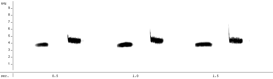 Spectrogram representing the song of a Great Tit (Parus major), from Wikipedia (Maxime Metzmacher, CC BY-SA 3.0)
After some quick googling, I found instructions on how to make a spectrogram from a .wav file in python, using scipy, numpy and matplotlib. I copied and pasted a few lines of code into a notebook, with the changes needed to load my own file and got a pretty spectrogram… Yay!
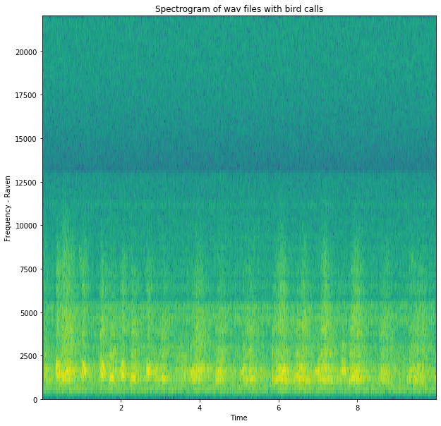
That was easy enough, but then I started looking at the code I had used to make it, to try to understand what it had done to the input .wav to generate the image:
` samplingFrequency, signalData = wavfile.read(“Raven.wav”) `
First, it extracted data from the .wav into two variables: samplingFrequency just held a single integer value (44100, which is probably the 44kHz I’ve seen mentioned about sound files) and signalData was a numpy array with lots of integer values inside. And these two variables were the only inputs into the matplotlib specgram function that generated the plot. It still wasn’t clear to me how it was going from a single frequency value and an array of values to the 3d spectrogram plot (time in x, frequency in y and intensity as colour)! That’s when I realised I had to do a bit more background reading to understand exactly what is in a .wav file and what kind of transformations are done on the data to generate a spectrogram.
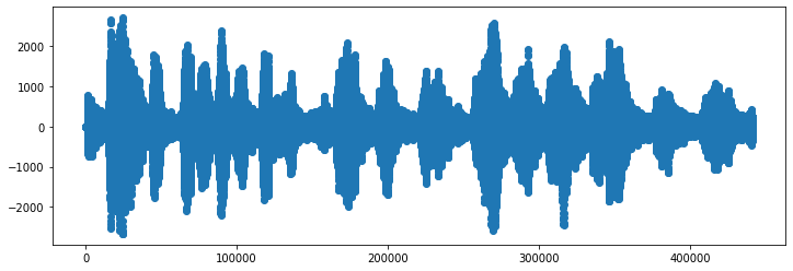
Sounds are stored in .wav files by dividing each second into fragments of 1/samplingFrequency seconds, with each one of those fragments getting a single integer value corresponding to the intensity of sound coming out of the speaker at that tiny point in time, and those all together make up the array that got saved into signalData in my example above. A plot of just those intensity values over time produces the sound wave shape that we’ve all seen in school:
But that’s still just an intensity and a time value for each point in the plot, where did the frequency values in the spectrogram plot come from??
The answer to that question requires a bit more maths than I want to go into here, but the plotting function from matplotlib is taking a Fourier transform*** of the sound signal. And as the text in wiki puts it so nicely, it “decomposes a function [the sound wave] into its constituent frequencies”, giving an intensity value to colour in each y-axis frequency point of the spectrogram!
I could have just blindly accepted the output of the matplotlib function and moved on, but not knowing even vaguely what was being done to the data was bothering me and this quick dive into sound files made me more comfortable with the whole thing.
Moving back to the dataset construction, I had a way to turn .wav files into spectrograms **** and now I just had to set up a pipeline to query the iNaturalist database, download the files, split them into equal chunks of time and pump out the spectrograms.
Cue corny time-lapse montage from 80s films
I downloaded all the sounds with the most reliable level of annotation for 4 different bird species: american robin (Turdus migratorius), common raven (Corvus corax), great kiskadee (Pitangus sulfuratus, labeled BemTeVi in the dataset *****), and house sparrow (Passer domesticus, labeled Pardal in the dataset *****). To my fun surprise, only about half of them were actually .wav and the rest were a mix of other file types, but I figured just the .wavs would be plenty of datapoints and chose to ignore the other types for now.
The length of the files ranged from just a few seconds to over 2 minutes, so I also had to cut them down into equal-sized chunks so the final spectrograms would all be in the same shape and scale. I arbitrarily decided to make them all into 10-second chunks and then did a bit of data augmentation by using a sliding window approach, where I moved along the sounds in 3-second increments. So the first image from a recording would cover the first 10 seconds, the second image would cover 10 seconds starting at second 3, and so on. It sounds a bit confusing, but hopefully the scheme below makes it a bit clearer:
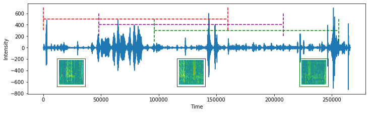 This sample sound got divided into three separate spectrograms, with the window of time corresponding to each highlighted in the original plot with a different colour. The overlap between adjacent spectrograms is clear when you compare repeating patterns that slide across each spectrogram in the series.
As I produced the images, I placed them into separate folders for each species, so that would act as my label when training models. I also randomly split 20% of the images off into a test set stored on a separate folder, so I could do hyperparameter optimisation later and compare models based on performance on that held-out test set.
I blitzed through this last part and probably made it look easy, but each of those steps took a decent amount of time to figure out the best way to do! All the code for this is in my iNaturalistDatasetGenerator repo, split a bit haphazardly into actual scripts and jupyter notebooks. As I said at the top, the actual model training will come in the next post, but I learned so much while just preparing the data that I thought it would be interesting to share here! And, as I’ve heard from pretty much every data scientist I’ve ever met, dataset construction and cleanup is one of the biggest parts of the job, so why hide it?
Footnotes
* At least more interesting to me than looking at pictures of actors, but whatever floats your boat!
** Technically, I should probably say “vocalisation”, but I’ll just stick with sound here because I’m not going to talk about other sounds made by birds that are not vocalisations, like wings flapping.
*** Not the Fouriest transform, though, sadly!
**** For the actual dataset, I chopped out the axes and text and made just a 224x224 pixel plot to be used as model input.
***** Because I randomly wrote those names in portuguese when I started writing the code and now I can’t be bothered going back and standardising on one language!